
Neutral Wedding Decor: Creating Timeless Elegance Without a Single Bold Color
Neutral Wedding Decor: Creating Timeless Elegance Without a Single Bold Color
You’re staring at a blank Pinterest board, feeling that familiar flutter of panic.
Your wedding is months away, and everyone keeps asking about your color scheme.
You don’t want something that screams “trendy” and looks dated in five years.
You don’t want to spend your entire budget on bold florals that might clash with your venue.
And honestly, you’re not sure how to make neutral tones actually interesting.
I get it.
When I started styling weddings, I thought neutral meant boring.
Beige tables, white flowers, and a whole lot of yawning guests staring at their phones.
Then I learned the secret: neutral wedding decor isn’t about playing it safe—it’s about creating a sophisticated backdrop that lets everything else shine, from the couple’s genuine emotions to candlelight dancing across cream linens.
—
What Exactly Is Neutral Wedding Decor?
Let’s start with the basics, because “neutral” gets thrown around like confetti.
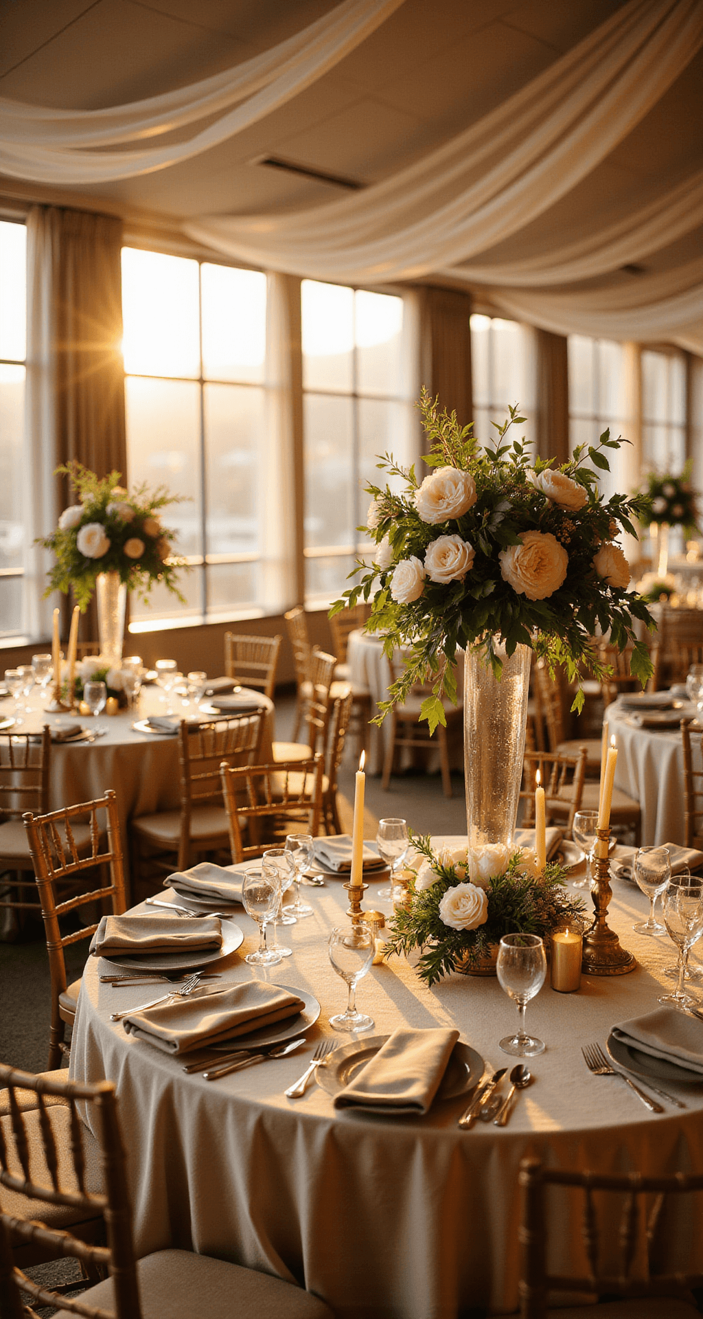
Neutral wedding decor uses soft, muted tones—think ivory, beige, taupe, gray, and champagne—layered with texture, greenery, wood, and subtle metallic accents to create a calm, timeless, and genuinely elegant atmosphere.
It’s not one color.
It’s not minimalist emptiness.
It’s a carefully considered palette where each element adds depth without competing for attention.
Here’s what makes it work:
- It adapts to any aesthetic: Classic, minimalist, boho, rustic chic, modern—neutrals play well with everyone.
- It’s seasonless: Whether you’re saying “I do” in snowy January or blazing August, neutral tones work year-round.
- It photographs beautifully: Soft tones don’t create harsh shadows, and they let candlelight, greenery, and florals steal the show in photos.
- It’s actually affordable: You’re not chasing rare, trendy blooms or custom dye lots.
—
The Real-World Timeline: What You Actually Need to Know
Before we dive into aesthetics, let’s talk logistics, because Pinterest doesn’t show you the 6 a.m. setup crews or the three hours spent arranging centerpieces.
Photography Time
If you’re creating content for a neutral wedding (whether for a blog, portfolio, or social media), here’s what you’re looking at:
- Event coverage (ceremony, reception, details): 6–8 hours for full-day wedding documentation.
- Detail shots and styled content (flat lays, tablescapes, decor vignettes): 1.5–3 hours, ideally blocked before guests arrive or during room turnovers.
- Behind-the-scenes moments (styling, setup, vendor action shots): 1–2 hours spread across morning and early afternoon.
Why this matters: Neutral decor thrives in photographs when you capture it properly.
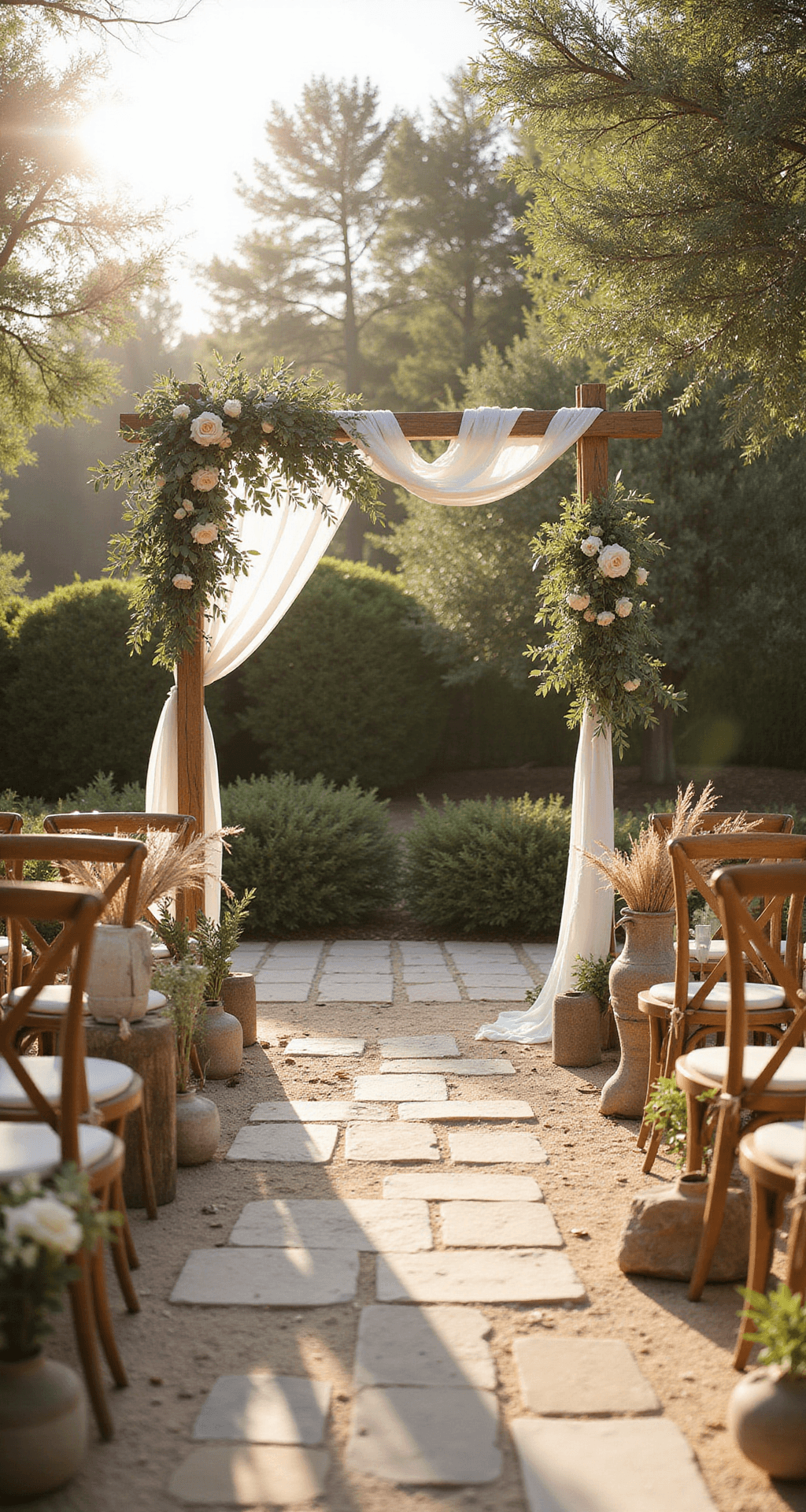
Soft shadows across cream linens, candlelight bouncing off textured fabrics, greenery backlit by golden hour—these moments require intentional shooting.
Styling and Setup Time
This is where many couples get blindsided.
- Decor setup (ceremony space, reception room, photo areas): 3–6 hours depending on complexity and floral arrangements.
- Tablescaping and floral arrangements: 2–4 hours for a fully styled neutral tablescape with layered linens, candles, and centerpieces.
Real talk: If you’re doing this yourself, budget more time.
If you’re hiring a florist and decorator, confirm these hours upfront so you’re not surprised by rush fees.
Total Content Creation Timeline
From concept to finished, polished wedding content: 2–3 full working days per wedding.
Save this article
Enter your email and we'll send it straight to your inbox.
That’s 1 day shooting + 1–2 days editing, color correcting, and scheduling posts.
Why mention this?
Because neutral decor requires precise color work in editing to look warm and inviting rather than washed out.
—
Budget Reality: What You’ll Actually Spend
One of the best-kept secrets about neutral wedding decor is that it doesn’t have to drain your bank account.
The Affordable Route
Simple ivory linens, clear glass vases, eucalyptus, and mixed-height white candles can look stunning.
You’re looking at basic costs from your rentals company plus supermarket florals and DIY arrangements.
Many couples spend $800–$1,500 on decor this way and achieve a genuinely elegant look.
The Mid-to-Luxury Approach
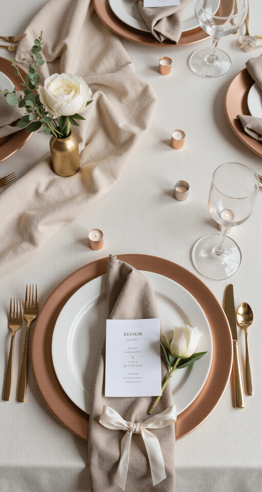
Premium textured linens, abundant florals, custom signage, metallic charger plates, and statement centerpieces.
This is where you hire professionals, invest in quality fabrics, and commit to floral abundance.
Budget: $3,000–$8,000+ depending on guest count and venue size.
The difference?
Not just the cost, but the impact.
Luxury neutral decor feels intentional—like someone cared about every detail rather than hoping it would work out.
—
The Color Palette: How to Choose Your Neutrals (And Actually Make It Work)
This is where most people mess up.
They choose one neutral and wonder why everything looks flat.
Your Core Palette
Select 2–3 base neutrals as your foundation:
- Ivory + taupe + soft gray (cool and modern)
- Cream + champagne + beige (warm and romantic)
- Soft gray + muted olive + sand (earthy and grounded)
Then add 1–2 accent colors that aren’t technically colors:
- Wood (tables, signage, chairs)
- Greenery (eucalyptus, olive branches, trailing foliage)
- Metallics (gold, champagne, or rose gold in holders and accents)
Total palette: 4–5 elements maximum.
More than that, and you’ve lost the calm, cohesive feeling that makes neutral work.
Popular Combinations That Actually Succeed
- Ivory + gold: Timeless, romantic, works for every season.
- Blush + gray: Softer and more sophisticated than straight ivory.
- Rustic taupe + sage: Perfect for outdoor and garden venues.
- Black + white: Bold and modern, surprisingly elegant.
- Beige + champagne: Warm, luxurious, and deeply romantic.
Warm vs. Cool Neutrals (Pick a Lane)
This matters more than
Want to keep this one?
We'll email you the link so you can find it again later.