The Complete Guide to Minimalist Wedding Decor: Creating Elegance Through Simplicity
What Actually Is Minimalist Wedding Decor (And Why It Matters)
Contents
Minimalist wedding decor is built on a radical idea: less genuinely means more. You’re not decorating with abundance. You’re decorating with intention. Every candle, every flower, every piece of fabric has a reason for being there. The philosophy strips away everything unnecessary and keeps only what serves your celebration.
Think of it like a well-edited sentence versus a rambling paragraph. Both communicate, but one lands with impact. That’s the difference between minimalist weddings and everything else.
The Foundation: Choosing Your Color Palette
Here’s where minimalist weddings live or die. Your color palette is everything because it’s literally the only visual language you’re using to communicate style. You can’t hide behind “more stuff.” So you need to get this right.
Start with your base colors first.
- White or cream (the purest choice, feels timeless and clean)
- Ivory (slightly warmer, less clinical than white)
- Light gray (sophisticated, modern, pairs with almost anything)
- Soft beige or taupe (warm, natural, forgiving)
- Black (bold, contemporary, requires confidence)
Pick one of these as your foundation. This is what your tablecloths, walls, and overall backdrop will be. Now—and this is crucial—decide on your accent color. Just one. Maybe two if you’re confident.
For a timeless, elegant feel:
- Navy blue (classic, pairs with white beautifully, feels sophisticated)
- Dusty green (natural, calming, surprisingly versatile)
- Charcoal gray (modern, works with any base color)
- Deep burgundy (rich, romantic, feels intentional)
For something softer and more romantic:
- Pale blush pink (gentle, feminine, never overdone when restrained)
- Soft sage green (nature-inspired, soothing, extremely on-trend)
- Warm taupe (earthy, sophisticated, universally flattering)
- Muted gold or champagne (warm, celebratory without being loud)
For something unexpected:
- Mustard yellow (creates warmth without feeling retro)
- Terracotta (earthy, modern, very current)
- Slate blue (moody, interesting, contemporary)
Here’s my personal trick: bring your accent color in through multiple textures and materials, not just one color-blocked section.
If your accent is dusty blue, you might have:
- Blue linen napkins
- Blue velvet chair cushions
- Blue stoneware plates or glassware
- Blue flowers in a vase
- A blue accent wall or backdrop
That repetition across different mediums creates visual interest without feeling chaotic. Your eye reads it as intentional design, not random decorating.
Mastering Texture and Materials
This is where I see most minimalist weddings go wrong. They nail the color palette but forget that your eye needs something to do. Without texture, clean and simple becomes flat and boring.
Incorporate natural materials intentionally:
- Raw wood (tables, signage, structural elements, creates warmth)
- Stone or concrete (flooring, serving pieces, adds weight and sophistication)
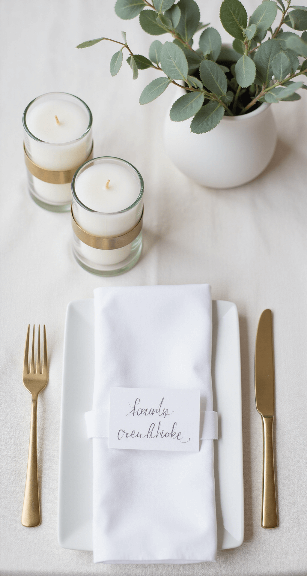
- Linen and natural fabrics (tablecloths, napkins, runners, feels organic and expensive)
- Glass (vases, candleholders, glassware, reflects light and feels refined)
- Metal accents (brass, brushed steel, copper, adds a modern edge)
- Leather (chair details, table runners, unexpected and luxe)
- Rattan or woven elements (baskets, placemats, adds organic texture)
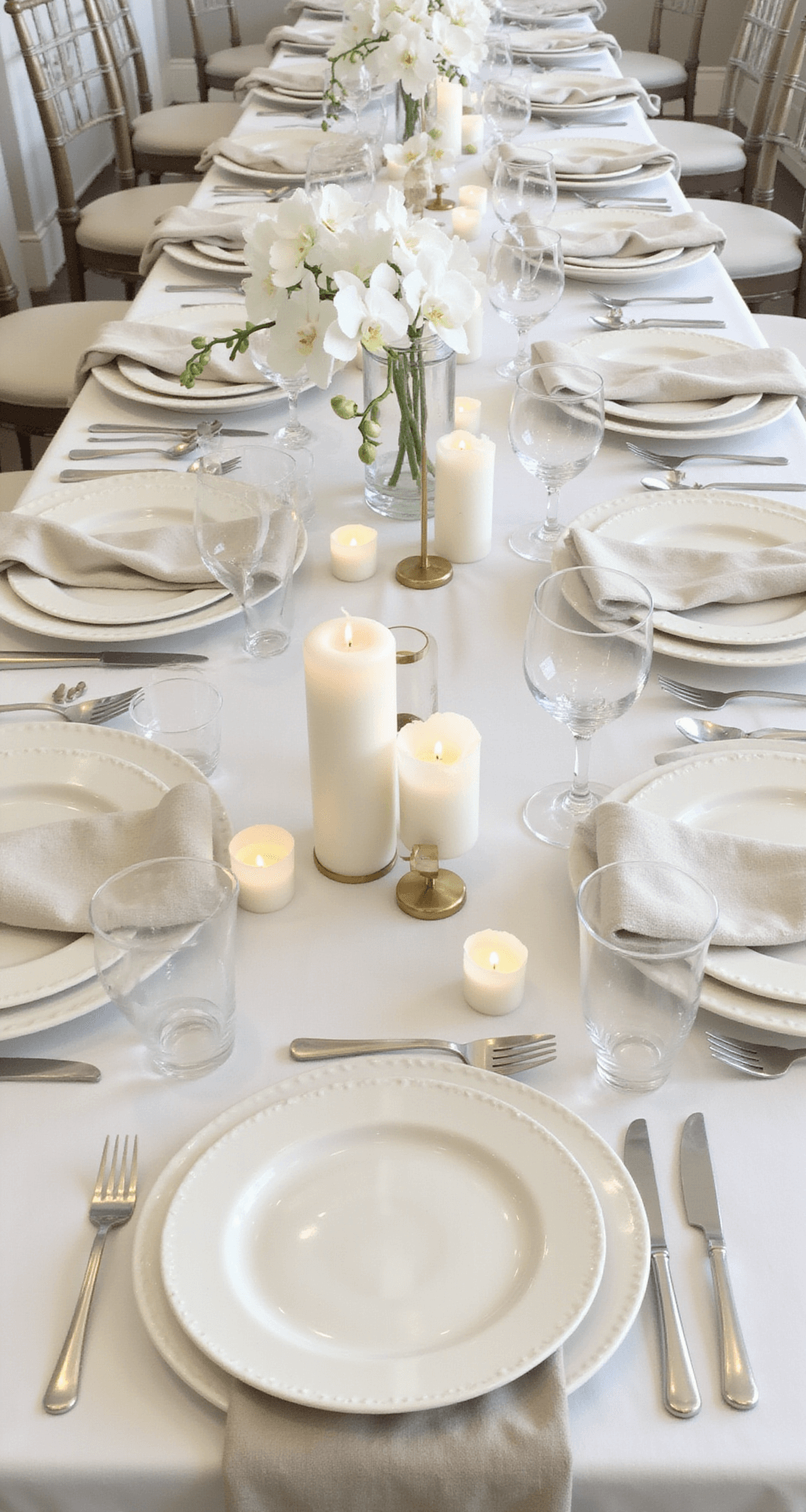
The magic is layering. A white linen tablecloth on a natural wood table with a stone fireplace in the background and brass candleholders creates a visual story. Your eye travels because there’s something interesting at every layer. Nothing matches exactly, but everything harmonizes.
The Ceremony: Creating Impact Without Clutter
Your ceremony backdrop is the first major design moment. This is where your guests form their impression of your entire aesthetic.
In a minimalist ceremony, your backbone is usually a simple structure with height.
Consider these approaches:
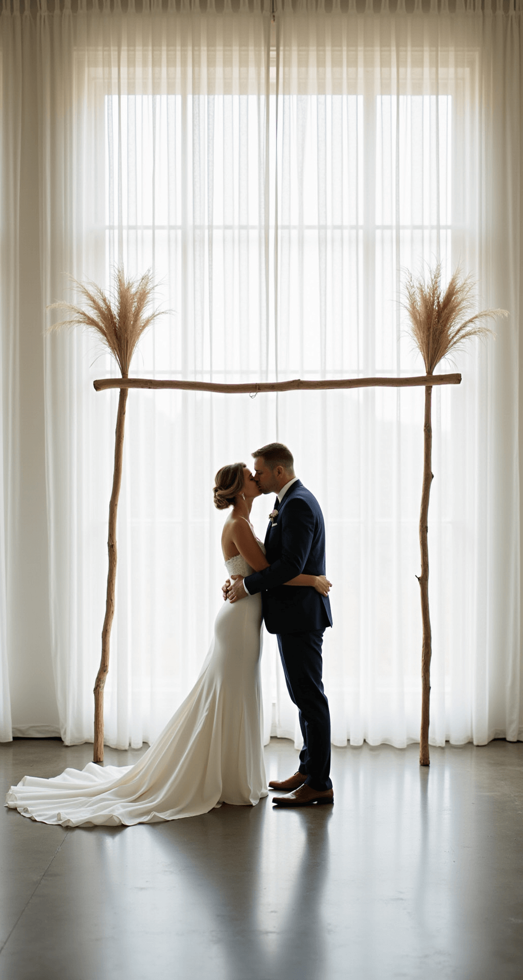
- Clean-lined wooden arch (white-washed, natural, or black painted) with exactly two statement florals on each side
- Floating frame or geometric arch suspended without visible support, creating drama through simplicity
- Blank wall or drape with a single element—one tall statement floral installation, a sculptural candle arrangement, or textured greenery
- Outdoor setting (forest edge, ocean view, mountain backdrop) where nature provides your drama and you add minimal decoration
The rule I follow: three elements maximum for the ceremony backdrop. A structure, one type of greenery or floral element, and lighting. That’s it. Everything else is excess.
For aisle markers, keep it refined:
- Small potted eucalyptus plants every third or fourth row
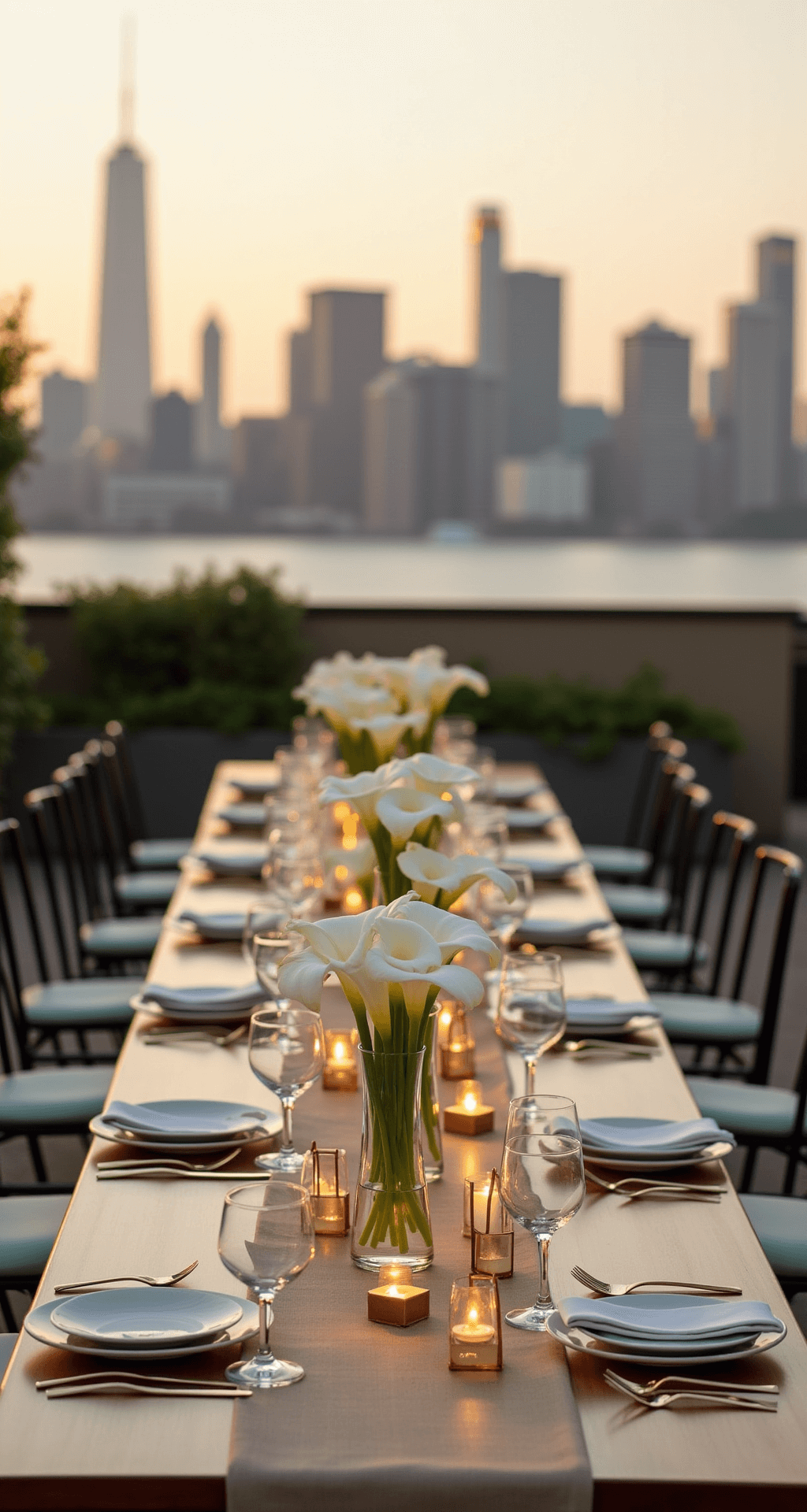
- Single white flowers (calla lilies, roses) tied to chairs with simple twine
- Scattered rose petals in your accent color down the aisle
- Tall, thin white pillar candles in glass hurricanes (elegant, uncluttered, safe)
The key is repetition over variation. The same element repeated creates rhythm and harmony. Different aisle markers scattered throughout feel chaotic.
