
Wedding Reception Table Decor: The Complete Guide to Creating Instagram-Worthy Tablescapes That Actually Work
What You Really Need to Know About Wedding Reception Table Decor
Let me start with the stuff that actually matters.
The timing is more generous than you think.
Setting up a fully styled reception takes about 2–4 hours if you’re doing linens, runners, centerpieces, candles, and place settings. If you’re adding DIY florals or custom seating cards, add another 1–2 hours. Photography-wise, you need roughly 1–2 hours to capture full table coverage—wide shots of the room, closeups of your head table, detail shots of individual place settings, and those moody candlelit shots that perform best on Instagram.
The venue size doesn’t limit you.
This approach works for intimate 20-person dinners, mid-sized 100-guest receptions, and grand ballrooms with 300 people. The secret is scaling your centerpieces and candle heights, not cluttering every available inch.
Your budget doesn’t dictate your success.
You can create stunning reception tables for under $500 total using bulk glass vases, greenery garlands from party suppliers, and simple tealights. Or you can invest in custom florals and designer linens if that’s your jam. The magic isn’t in how much you spend—it’s in how intentionally you layer textures and repeat your color story.
DIY difficulty matters, and that’s okay.
Floating a few bud vases down the center with greenery and candles? That’s genuinely easy. Layering chargers, dinnerware, and mixed-height candles with confidence? Moderate skill, but totally learnable. Full floral installations with hanging elements and fully customized place settings? That’s where you might want professional help. Know your comfort zone, and don’t pretend a Pinterest board is the same as executing a 12-table setup.
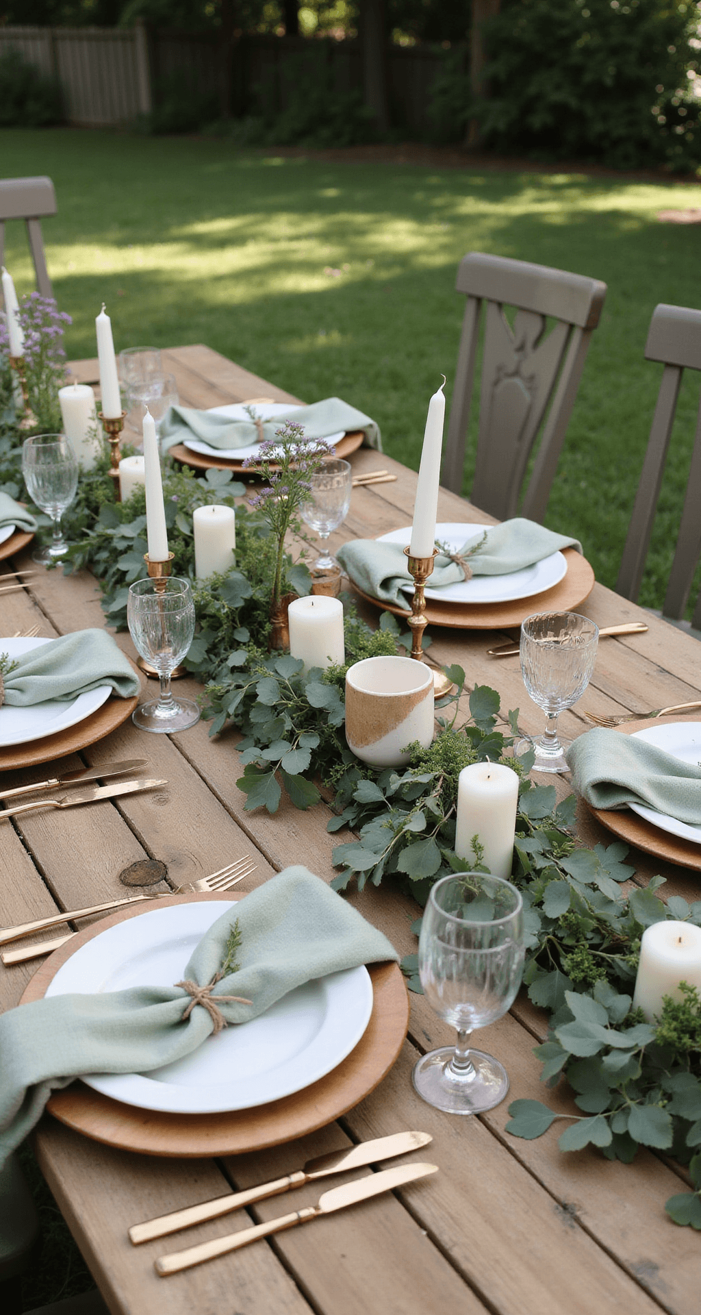
The Color Palette That Actually Makes Your Tables Sing
This is where most people get stuck.
They see a gorgeous inspiration image and think, “I’m doing that exact combination.” Then they end up at the florist with 47 colors that look nothing like the photo because lighting, fabric finishes, and real-life textures are completely different from what’s on a screen. Let me give you a better framework.
Soft pastels work beautifully if you lean into layered textures.
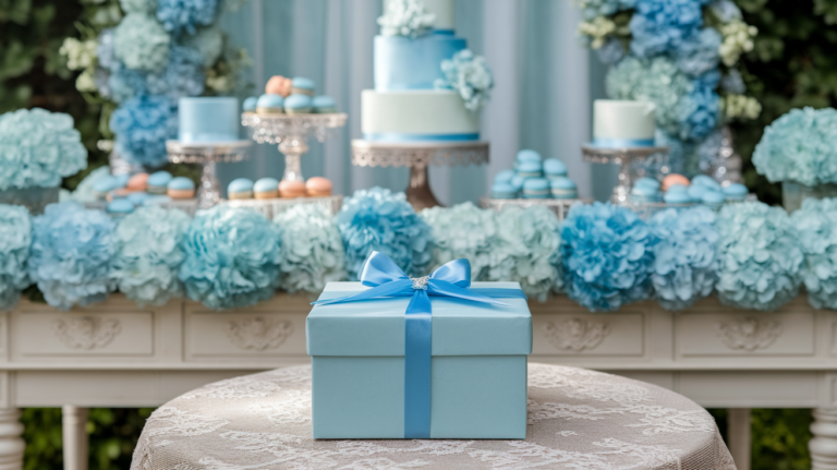
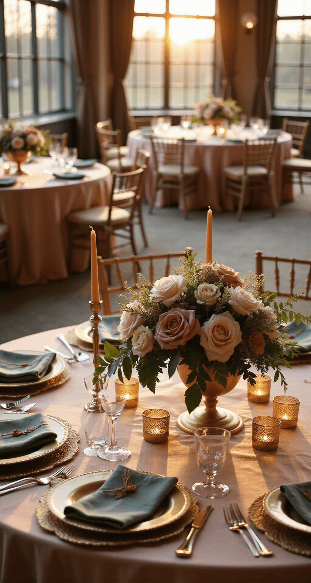
Blush, sage, dusty blue, and champagne sound boring until you combine them with linen in different weaves, brass candle holders, and mixed glassware. Add white and ivory as your grounding neutrals, and suddenly your table looks intentional, not washed out.
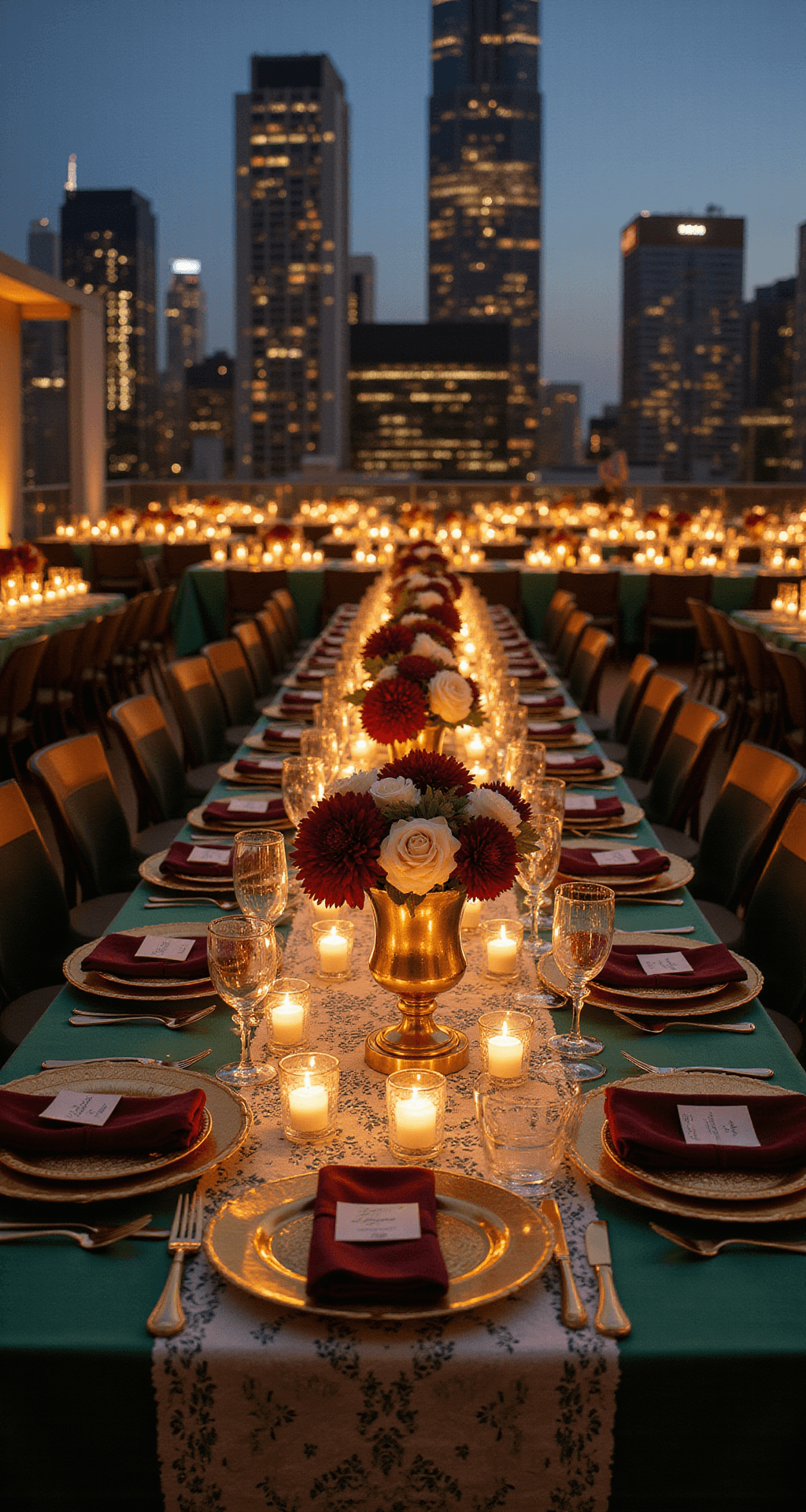
Jewel tones demand restraint.
Emerald, burgundy, navy, amber. These are showstopping colors, but they can feel heavy if you use them everywhere. Pick one as your hero (usually in the larger items like linens or a statement floral), keep one as your secondary (maybe in napkins or smaller florals), and use gold or brass metallics to warm everything up.
Neutral and monochromatic palettes are underrated.
Ivory, taupe, sand, charcoal, and black-and-white combinations feel modern and timeless. But they only work if you make them interesting through texture. White on white gets boring fast.
Seasonal colors anchor your theme without overthinking it.
Save this article
Enter your email and we'll send it straight to your inbox.
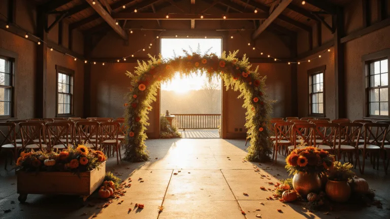
Spring = pastels and pastels mixed with white. Summer = brights, fresh greens, maybe citrus accents. Fall = rust, terracotta, amber, deep burgundy, burgundy, gold. Winter = emerald, deep navy, jewel tones, metallics, or go full monochrome with whites and silvers. When you follow seasonal color cues, your tables automatically feel cohesive because nature is already doing the design work.
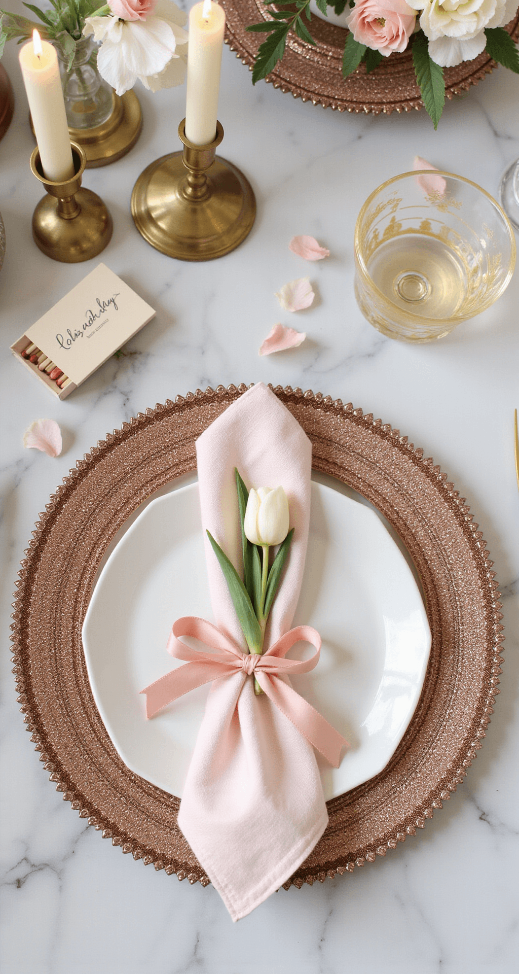
The Texture Layering That Makes Tablescapes Photograph
Here’s the thing about wedding reception tables: they look flat and boring when you use only one texture. A plain white tablecloth is just a plain white tablecloth. But a plain white tablecloth under a gauzy runner with a textured linen napkin, a ceramic bud vase, and mixed brass and clear candleholders? That’s a photograph.
Start with your base layers.
Your tablecloth is your foundation. Go for natural linen or cotton when possible—it photographs better than polyester, and guests actually want to touch it. If you’re in a warm climate or dealing with a serious budget, high-quality polyester works, but commit to the texture: matte velvet-look finishes photograph better than shiny satin.
Add a runner to break up the monotony.
A runner doesn’t need to be the full length of the table. You can run it down the center 2/3 of the way, let it puddle dramatically at the ends, or layer multiple runners at different angles for a modern, relaxed vibe.
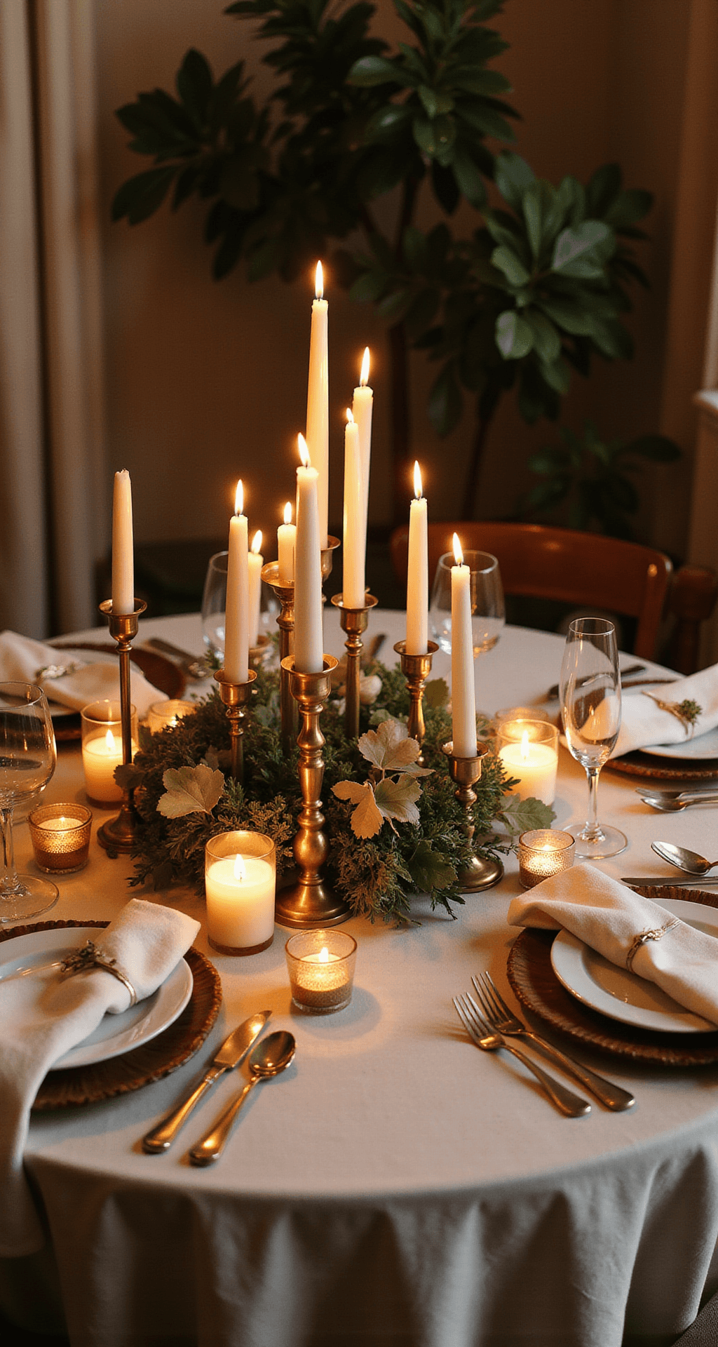
Napkins are your secret weapon.
Most people throw a napkin on a plate and call it done. But a thoughtfully styled napkin—folded just so, tied with a silk ribbon, tucked around a sprig of eucalyptus or herb—reads as intentional and luxe. Cloth napkins always photograph better than paper.
Your centerpieces need height variation.
If everything on your table is the same height, it’s boring to photograph and boring to look at across the table. You need visual interest at different levels.
Candleholders and vases need to be mixed materials.
This is the detail that separates “nice table” from “this is on Pinterest for a reason.”
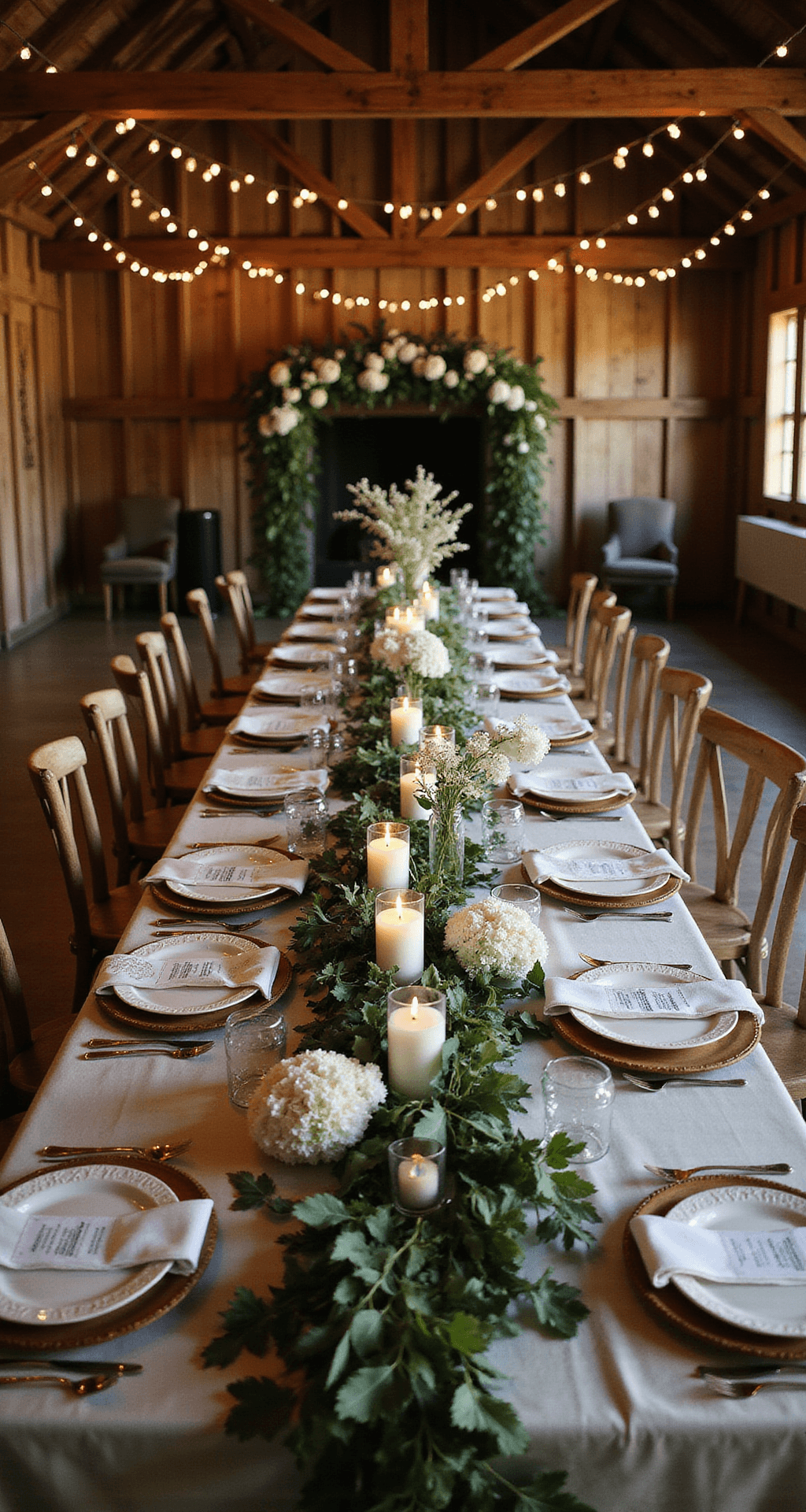
Chargers are underrated style multipliers.
If you’re not using chargers, you’re missing an opportunity. They immediately elevate a place setting and give you another texture layer.
Building a Cohesive Color Story Across the Whole Reception
You pick three colors as your palette—let’s say blush, sage, and gold. Now you need to repeat them intentionally so your guests see them everywhere without it feeling overwhelming.
Your florals should carry the main color story.
If blush and sage are your hero colors, 60% of your floral arrangement should be those tones, with greenery and gold accents making
Want to keep this one?
We'll email you the link so you can find it again later.