
Jewel Tone Wedding Decor: How to Create a Regal, Opulent Celebration That Glows with Luxury
What Exactly Is Jewel Tone Wedding Decor?
Jewel tone wedding decor is built on rich, saturated colors inspired directly by gemstones: emerald, sapphire, ruby, amethyst, garnet, and topaz. Think deep greens that glow like precious stones. Think sapphire blues that seem to have depth inside them. Think burgundies and plums that look like wine held up to candlelight.
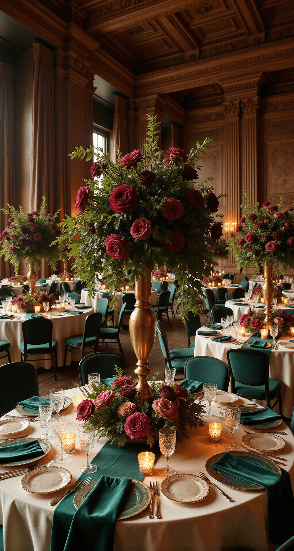
The magic isn’t just the colors—it’s how you layer them. You’re adding luxe textures (velvet, satin, lace), candlelight by the dozen, and metallic accents (gold, brass, copper) that catch the light and make the whole palette shimmer.
The result? A regal, immersive atmosphere that feels more like stepping into a palace than a typical wedding venue. This style works especially well for fall and winter celebrations or any evening event where warm lighting can make those rich colors glow like actual jewels.
Why Jewel Tones Work (And When They Work Best)
Here’s what I’ve learned: jewel tone wedding decor isn’t for every couple, and that’s okay. It’s for you if you love:
- Bold color without apology or hesitation.
- Formal and black-tie aesthetics or luxury celebrations.
- Evening events where candlelight and warm lighting set the mood.
- Editorial-style photography and moody, dramatic imagery.
- Historic venues, ballrooms, or mansions where deep colors feel at home.
- Fall and winter weddings where rich tones align with the season.
But here’s what trips people up: venue choice matters deeply. A large ballroom with good architectural features and the ability to control lighting? Perfect. An intimate restaurant with minimal lighting flexibility? Risky. An outdoor daytime ceremony in bright sun? Jewel tones will look flat and muddy.
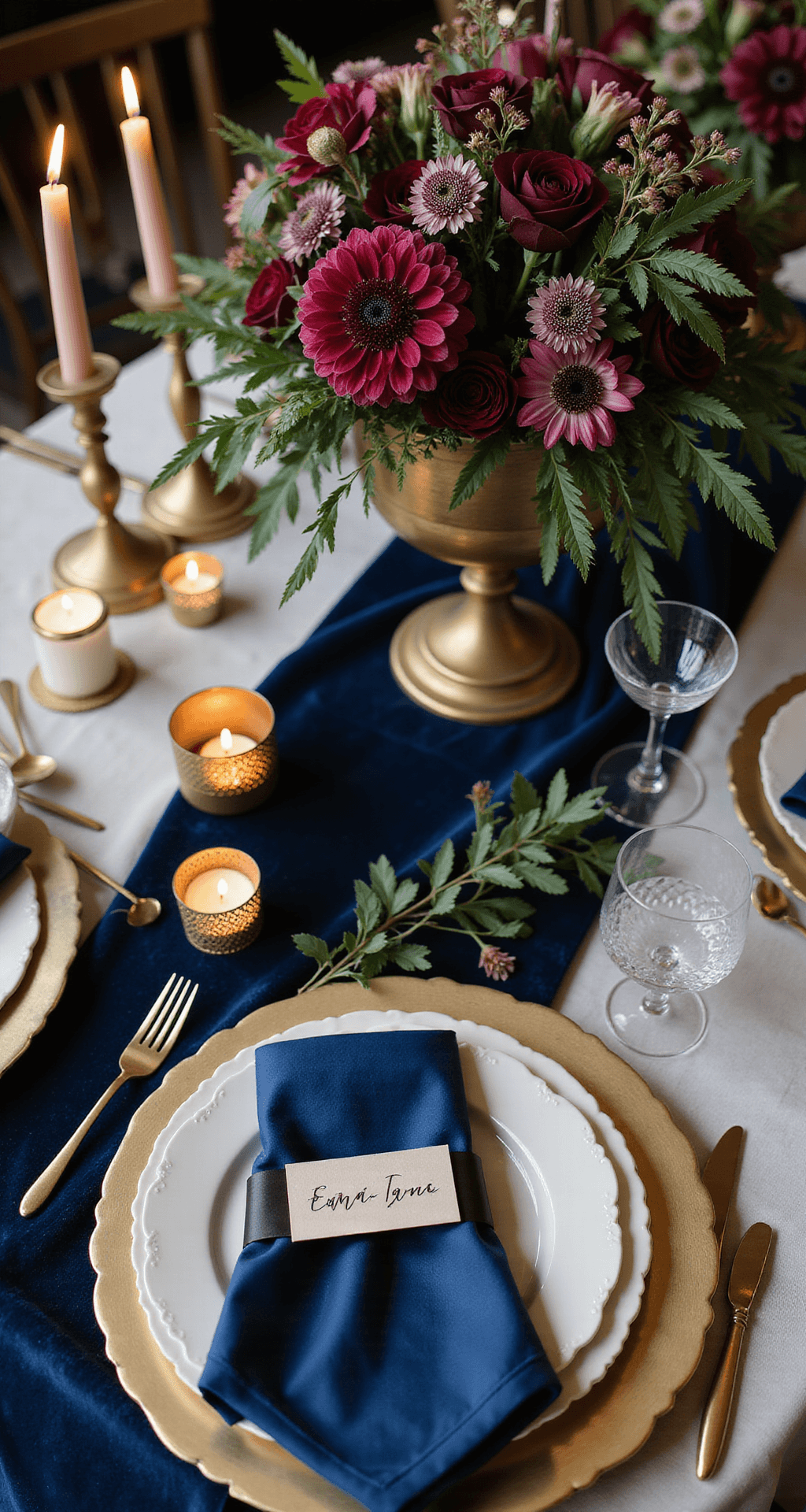
The Real Timeline: What You Actually Need to Know
Photography Time
If you want full coverage that captures how stunning jewel tones look under different lighting conditions, plan for 6–8 hours of professional photography for a standard wedding day. Why that long? Because jewel tones transform throughout the day. Morning light hits them one way—true color, crisp details. Sunset light warms them up differently. And candlelit evening shots? That’s where they truly become jewels.
Styling and Setup Time
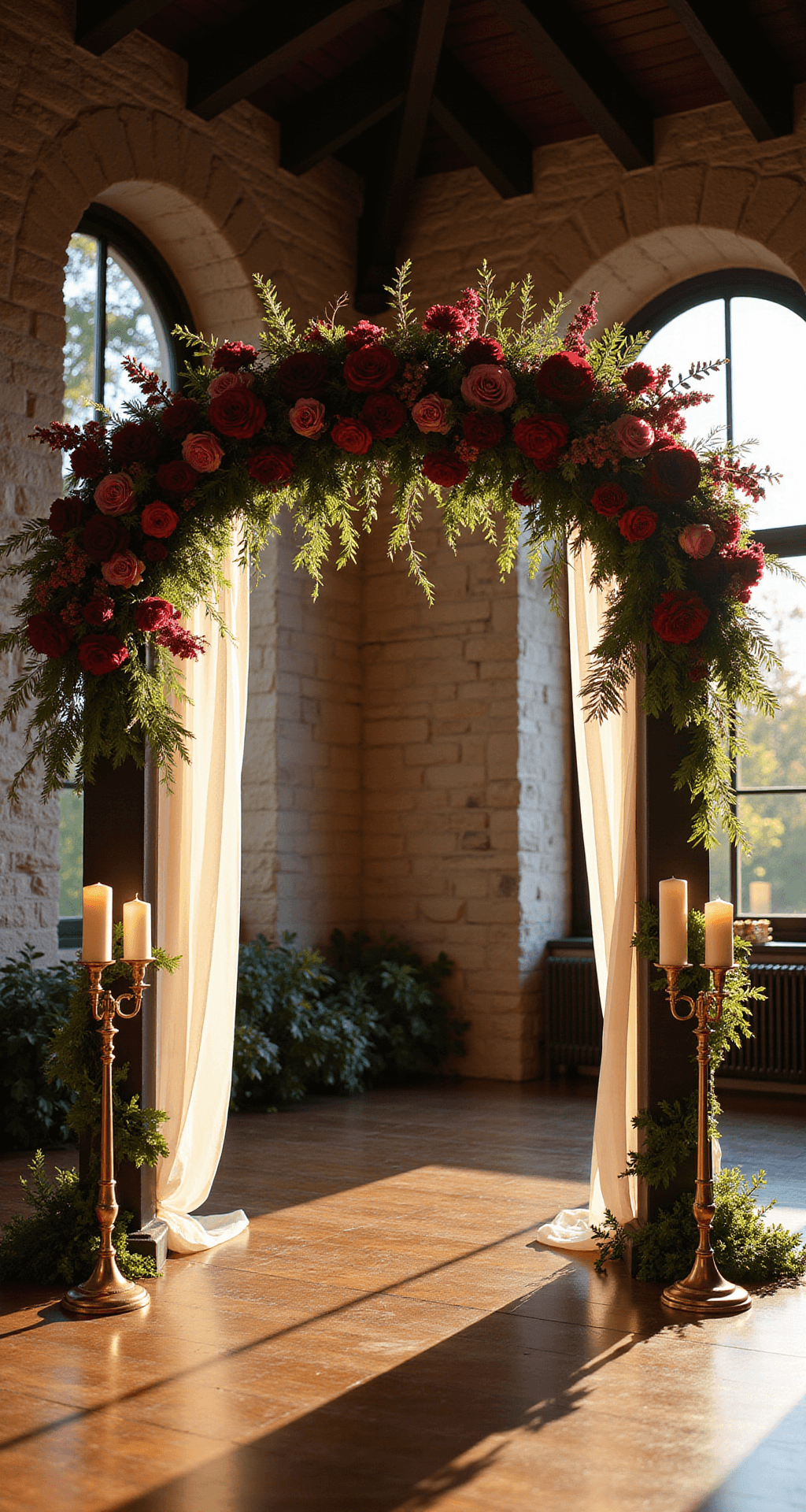
For a fully styled jewel tone reception—tablescapes, lounge corners, cake table, photo backdrop, signage—expect 3–6 hours of on-site setup, depending on how elaborate you want to go. If you’re keeping it simple (colored linens, basic centerpieces, scattered candles), you’re looking at the lower end. If you’re installing custom floral installations, layering velvet textiles, creating statement arches, and designing multiple focal points, you’re creeping toward 6 hours or more.
Save this article
Enter your email and we'll send it straight to your inbox.
Content Creation and Post-Production
Before you even walk into the venue, you’re spending 3–5 hours on mood boards, shot lists, Pinterest research, and vendor coordination. On the actual wedding day, you’re capturing content for 6–10 hours (depending on how many detail shoots and styled moments you want). Then comes the backend work that nobody talks about: culling, editing, color grading, and creating Pinterest/Instagram-ready assets. For a heavily styled jewel tone wedding with multiple focal points and detail shots, expect 8–15 hours of post-production work.
The Right Venue Matters More Than You Think
I cannot overstate this: venue choice determines whether jewel tone wedding decor shines or falls flat.
Best Venues for This Palette
- Large ballrooms with high ceilings and architectural interest (crown molding, exposed brick, historic paneling).
- Historic mansions and estates where dark wood, stone, and existing architectural details complement deep jewel tones naturally.
- Evening celebrations in any venue where you can control lighting and layer candlelight.
- Venues with dark walls or existing dark wood because deep colors need visual contrast to feel intentional rather than overwhelming.
Venues to Approach Carefully
- Bright, white, minimalist modern spaces where jewel tones can look out of place or make the room feel dark.
- Outdoor daytime venues where you can’t control natural light and bright sunshine flattens deep colors.
- Small, intimate spaces where rich colors can feel claustrophobic without strategic lighting and neutral balance.
- Venues with poor lighting control where you can’t adjust uplighting, add candlelight, or create the warm ambiance jewel tones need.
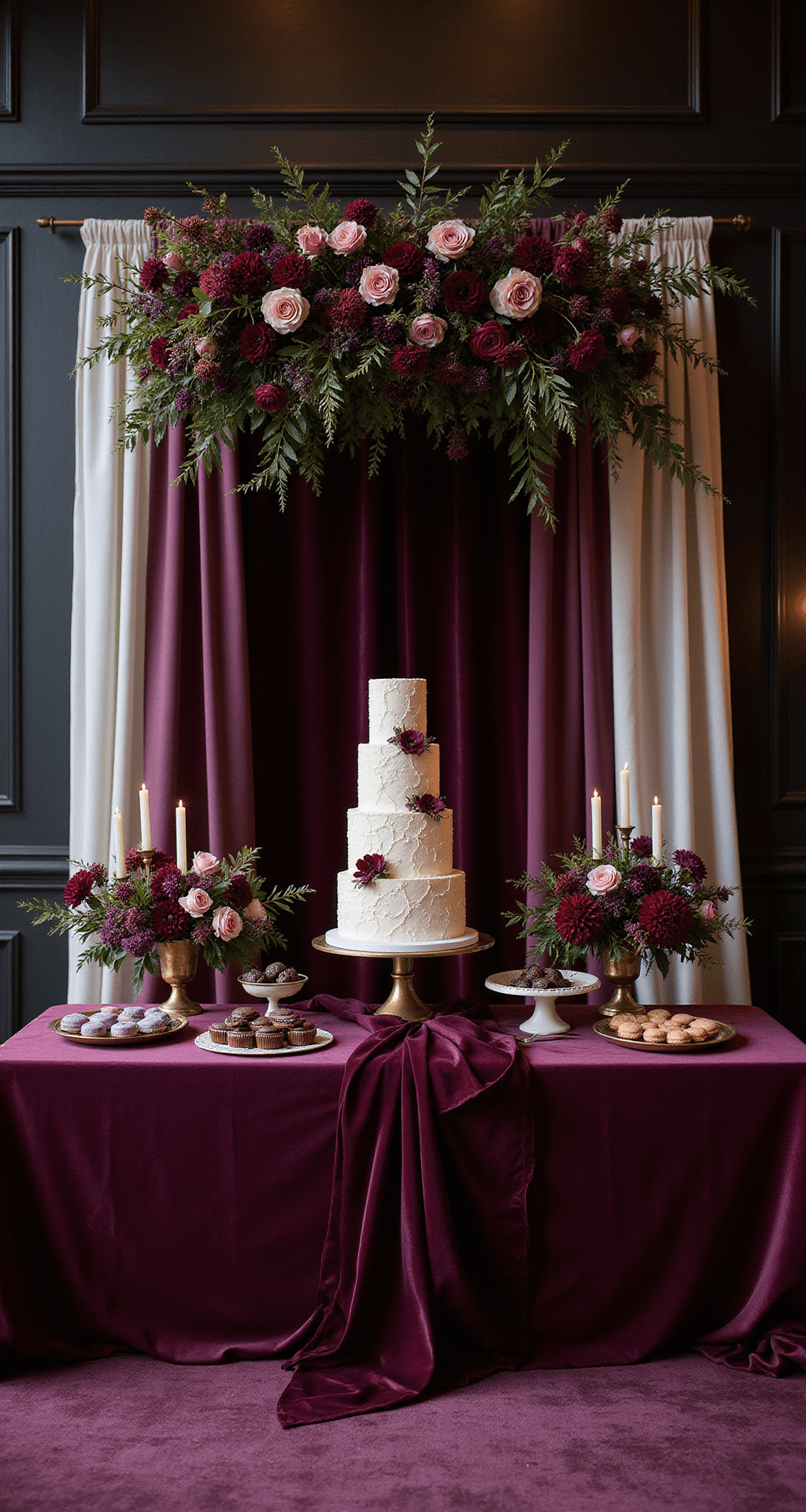
The Color Palette: How to Choose Without Overwhelming the Room
Here’s where most people get stuck: they see emerald, sapphire, ruby, amethyst, garnet, and topaz and think, “I’ll use all of them!” Then their reception looks like a rainbow threw up on velvet. Don’t do that.
The Right Approach
Choose one primary jewel tone. This is your anchor color—the one that dominates the palette and appears in the biggest design elements. Maybe it’s emerald (most popular, versatile, pairs beautifully with gold). Maybe it’s sapphire (moody, sophisticated, feels almost navy in certain lights). Maybe it’s amethyst or burgundy (warmer, more intimate, especially gorgeous for fall).
Add 1–2 supporting tones that complement your primary color but don’t compete with it. If emerald is your anchor, pair it with sapphire accents and maybe a touch of amethyst in florals. The supporting tones should appear in smaller quantities: maybe in specific florals, a secondary linen color, or an accent wall.
Introduce a metallic accent color (gold is most common, but brass, copper, and silver work too). This is what prevents the palette from feeling too dark or heavy. Metallics catch light, reflect it back into the room, and make the whole composition feel more dimensional. Gold especially pairs with jewel tones like they were made for each other.
Balance with neutrals ruthlessly. This is non-negotiable: cream, taupe, soft grey, white, or ivory. These appear in your linens, napkins, perhaps your bridesmaid dresses, signage backgrounds, or architectural elements. Neutrals give the eye a place to rest and let your saturated jewel tones actually pop instead of feeling overwhelming. I’d aim for roughly 60% jewel tones + metallics, 40% neutrals + negative space.
Want to keep this one?
We'll email you the link so you can find it again later.